Evera - News App

Evera - News App

What is Evera?

Evera is a News app that can generate news as audio bytes based on the user's interests and provide it in the user's preferred language. Listen to news anytime, anywhere even during commute without wasting time on scrolling huge content.

What is Evera?

Evera is a News app that can generate news as audio bytes based on the user's interests and provide it in the user's preferred language. Listen to news anytime, anywhere even during commute without wasting time on scrolling huge content.

My Role

Product Design Lead — Research & Ideation, Scope planning, User Interface & Experience, Interaction Design

My Role

Product Design Lead — Research & Ideation, Scope planning, User Interface & Experience, Interaction Design

Team

Kiran Kumar (Designer)

Lakshmi (Product Manager)

Keerthana (Front End Developer)

Duration

August - October 2021

Project Goal

To provide news anytime, anywhere that's happening around the globe in the form of a voice in multiple languages through a super intuitive app.​

Design Process

As the first step of the design process, we began with research, which included user interviews, surveys, and desk research. We believe it's important to understand the users' needs and their problems at the early stage before starting to sketch ideas.

Design Process

As the first step of the design process, we began with research, which included user interviews, surveys, and desk research. We believe it's important to understand the users' needs and their problems at the early stage before starting to sketch ideas.

After getting the insights, we began to conceptualize the solution and started to do random sketches on paper. We started with user flows and then created some wireframes (Sketching on paper gives us a way to iterate ideas faster). From there, we proceeded with the actual designs on the computer using tools like Miro or Whimsical for user flows and Adobe XD for interface design and prototyping.

Once the interface and prototype was ready, I took it for testing with my team to get their feedbacks and their perspectives on the design.

Research

Our research began with a fundamental question WHY? When there are so many products already out there in the market, what is the need for another app? What are the prevailing issues users encounter with existing apps, and how can we address them effectively? To tackle these questions, we initiated user interviews and surveys to gain insight into the underlying needs.

User Interview

I interviewed 5 people of both male & female aged between 23-50. The interview took approximately between 25-30 minutes and covered the topics of the user's pain points and expectations. Asked questions were :

User Interview

I interviewed 5 people of both male & female aged between 23-50. The interview took approximately between 25-30 minutes and covered the topics of the user's pain points and expectations. Asked questions were :

  • How often do you read News?

  • How much time do you spend reading the news?

  • What are the News Apps you use?

  • What are the problems you face with the current apps you use?

  • Would you prefer to read or listen to the news?

and a few more relevant questions based on their replies.

Survey

A set of questions were prepared and sent to many people through social media. I got around 70 responses which were good enough to understand the user's needs.

Survey

A set of questions were prepared and sent to many people through social media. I got around 70 responses which were good enough to understand the user's needs.

Customer Insights

After analyzing the interviews and survey, despite the amount of generated data, this was the most relevant information for decision-making in creating the solution

Desk Research

In addition to the above user research process, we conducted further research to assess the features offered by current apps. Our goal was to establish benchmarks by examining what competitors had developed.

The article "Top 10 Free News Apps In India 2020" published by Whizsky.com provided a list of popular apps such as Google News, Inshorts, Daily Hunt, etc., elucidating why they are widely used in India.

We proceeded to utilize all these apps to identify the problems they address and how they tackle them, as well as to pinpoint any areas where they fall short, based on the data we gathered from our user research.

Problem Statement

There is an abundance of news and content being generated today across numerous blogs, news websites, and apps. Almost all of them consist of text-based content with video snippets in-between. In the current busy day and age, it is challenging to sit and read through lengthy documents. This is precisely why voice and video-based content are gaining popularity. While audiobook companies like Audible have been around for a while, there is no service like Audible for everyday news.

Additionally, most of the "expert content" in many fields of interest such as technology, business, medicine, and health is created in English or other languages that are not native to many Indian and Asian populations.

Concept

The idea is to create a simple news aggregator app, that will list content like news, blogs & Books (Future plan) from trusted sources.

There are two key differences between Evera and other news aggregation apps like Daily Hunt or Inshorts, they are:


  1. The entire news article is available as Audio bytes + Text.


  2. English language content is translated into the customer-specific language in both text and audio.

There are two key differences between Evera and other news aggregation apps like Daily Hunt or Inshorts, they are:


  1. The entire news article is available as Audio bytes + Text.


  2. English language content is translated into the customer-specific language in both text and audio.

Proposed Solution

The solution is to create an aggregator app where users can follow or select specific topics, blogs, or news channels along with their language preferences. The Evera app will then generate a news feed specific to the user, where the news feed primarily consists of voice-based content and limited text news in their chosen language.

Evera is also a learning application where it learns users' behavior and offers better-personalized news content for the user.

Features of Evera

  • Translates news to Preferred Language.

  • Download & Save the news to listen in offline mode.

  • Listen to news even when the screen is locked.

  • Upload your own PDF or DOC file & get it converted to Audio bytes. 

Information Architecture

Sketchs / Wireframes

Initial Sketches

I experimented with various ideas for the app design, but these initial designs were somewhat complex and lacked novelty or excitement. They resembled the typical design of any news app currently available. After testing and discussing with the team, we realized the need for something better and more refreshing.

Final Sketches

I scanned all the sketches and made a rough prototype on Adobe XD for testing.

Final Designs

Splash & Login Screen

I experimented with various ideas for the app design, but these initial designs were somewhat complex and lacked novelty or excitement. They resembled the typical design of any news app currently available. After testing and discussing with the team, we realized the need for something better and more refreshing.

Choose Language & Interests

Home & Search Page

News Article Page

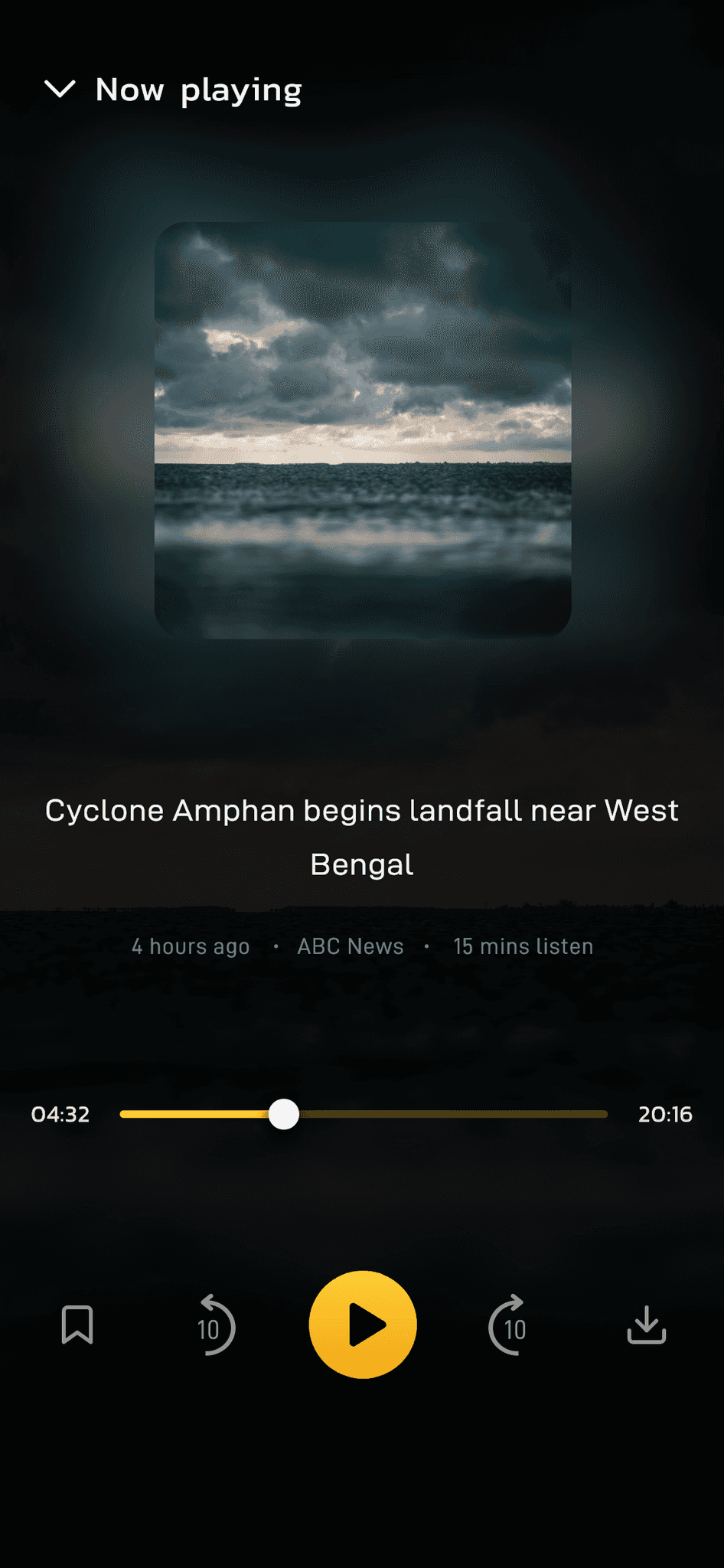
News Player Page

My Story Page

Downloads Page

Multiple language Support

Profile & Bookmark Page

Prototype

Check out the prototype of the design here.

Visual Language

Colors

We decided to go with the trend of Dark Theme as we felt this product would complement dark colors well. We chose vibrant yellow as the primary color to provide good contrast with the dark colors.

Colors

We decided to go with the trend of Dark Theme as we felt this product would complement dark colors well. We chose vibrant yellow as the primary color to provide good contrast with the dark colors.

Typography

Our target audience ranged from young teenagers to little older people, so having a typeface likable by both was essential. So I used the combination of D-Din for bold, clear readability & legibility, and Kanit for modern and futuristic style.

Typography

Our target audience ranged from young teenagers to little older people, so having a typeface likable by both was essential. So I used the combination of D-Din for bold, clear readability & legibility, and Kanit for modern and futuristic style.

Icons

I created most of the basic icons myself in XD, and a few were used from feather icons by Cole Bemis. All the icons are composed on a 24 x 24px grid with a 2px Stroke width for visual consistency.

Icons

I created most of the basic icons myself in XD, and a few were used from feather icons by Cole Bemis. All the icons are composed on a 24 x 24px grid with a 2px Stroke width for visual consistency.

Other Components

Other Components

Feedback / Validation

Once I completed the first version of the design, I shared it with rest of the team for review. We then went through a few changes to get the best design out. After a few iterations, the above design was the final outcome we settled for. 

The Evera app was not a one-time delivery design. It should be iterated by considering usability tests, A/B tests, and other in-depth surveys with the user to improve the initial version.
​​
That said, launching this app is only the first step towards the product's success.

The app is currently not in production, but will launch again very soon.!

Say Hello!

If you've scrolled this far, I believe we'll make a great team. I'm always open to exciting opportunities, collaborations, or just a friendly chat. Let's create something great together!

Say Hello!

If you've scrolled this far, I believe we'll make a great team. I'm always open to exciting opportunities, collaborations, or just a friendly chat. Let's create something great together!

Open to Work

Currently living in GDL, Mexico.

Time is

10:18 PM

,

and I've logged off. My laptop and I are taking some rest now.

100% Design

Made with

in Framer

Open to Work

Currently living in GDL, Mexico.

Time is

10:18 PM

,

and I've logged off. My laptop and I are taking some rest now.

100% Design

Made with

in Framer